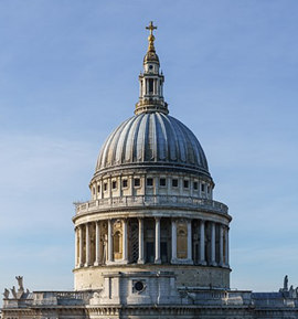
Photographing Historic Buildings
This article originally appeared as ‘Coming to the point’ in IHBC’s Context 151, published in September 2017. It was written by Rob Cowan, editor of Context.
Photographing Historic Buildings, Steve Cole, Historic England, 2017, 257 pages, 490 colour photographs.
‘The minimum standard [in architectural photography] is to achieve a correctly exposed, sharp image, and the next most important quality is that the vertical planes of the building should be represented as vertical in the photograph,’ writes Steve Cole in the early pages of Photographing Historic Buildings. ‘This continued a standard that painters and draughtsmen had been adhering to for centuries, but it was important to re-establish it for photography as the new invention could produce very inaccurate representations of buildings. This standard for representing vertical as vertical is one we should still strive to achieve.’
That injunction to ‘keep the verticals vertical’ is indeed generally accepted as the first rule of architectural photography. Dare we ask: why? If we look at a building from fairly far away, with our eyes looking more or less towards the horizon, the building’s verticals will indeed appear vertical. But usually we look at buildings from fairly close up and looking upwards, in which case the verticals will appear to converge, in the same way as the horizontal lines on the ground plane appear to converge in what we understand as perspective.
So why do photographers not photograph buildings in ways that show the convergence? Well, they do sometimes, and there are a few examples of such photographs in this book, but professional architectural photographers do not do it very often. Architectural photographers avoid showing verticals converging by choosing a viewpoint (high or far away, for example) that prevents it, or by using a specialist perspective-correcting lens, or by later manipulating the digital image.
Generally architectural photographs with verticals shown as vertical look good, but they sometimes look rather odd, due to the fact that the convergence that we would expect to see in reality is missing, and the top of the building looks too wide. But to some extent our brain adjusts and ignores that distortion, in the same way as it sometimes (but not always) prevents us from noticing the converging verticals of an actual building that we are looking at.
When is it appropriate to break the golden ‘vertical verticals’ rule and show verticals in a photograph converging? How can the photographer work out how much convergence will look right? (For example, a very slight convergence in a photograph usually looks incompetent. Too much convergence may make the building appear to be falling over backwards.) It would have been good to have had some discussion of those tricky questions in Photographing Historic Buildings.
Cole notes that ‘the power and ease with which images can be manipulated in an editing programme is an ever-increasing temptation to modify what the camera saw.’ True, but the manipulation does not start there: what the camera saw depends on what the photographer showed it. The camera never lies (don’t blame the camera), but the photographer always interprets.
Those quibbles aside, this is an exceptionally good book. Steve Cole, former head of photography at English Heritage, provides a wealth of advice that would benefit any photographer, from beginner to professional. Each of the book’s many photographs has a caption that explains an important point. Particularly useful and well-illustrated sections explain how to photograph specific subjects (staircases, for example) and how to carry out a photographic survey.
There is much detailed technical advice. Some of it will probably soon become redundant. This, as Cole explains, is due to the new Light Field system of capturing images, which seems likely to revolutionise photography by doing away with the need to focus the camera and choose the correct aperture.
But Cole’s guidance on the art of taking successful photographs will be of value as long as people are trying to convert the experience of seeing buildings – which usually involves being on the move, looking up and down, with our glance flitting over the surface of what is in front of us, seeing some things in focus and others in peripheral vision, and with our brains interpreting what we see – into two-dimensional, rectangular, static images.
At £20 the book is good value.
This article originally appeared as ‘Coming to the point’ in IHBC’s Context 151, published in September 2017. It was written by Rob Cowan, editor of Context.
--The Institute of Historic Building Conservation
Related articles on Designing Buildings Wiki
- Anthony Weller - Architectural photographer.
- Architectural photography.
- CIOB holds the Art of Building photo contest.
- Conservation.
- Construction cameras.
- Grant Smith - Architectural photographer.
- How to commission architectural photography.
- IHBC articles.
- Photographing buildings.
- Simon Kennedy - Architectural Photographer.
- Skyscrapers, staircases and optical illusions - the Art of Building is back.
- The Institute of Historic Building Conservation.
IHBC NewsBlog
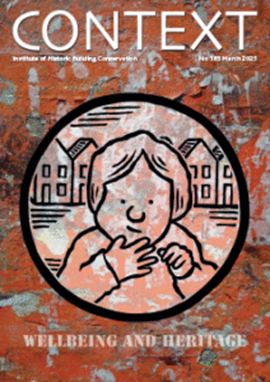
IHBC Context 183 Wellbeing and Heritage published
The issue explores issues at the intersection of heritage and wellbeing.
SAVE celebrates 50 years of campaigning 1975-2025
SAVE Britain’s Heritage has announced events across the country to celebrate bringing new life to remarkable buildings.
IHBC Annual School 2025 - Shrewsbury 12-14 June
Themed Heritage in Context – Value: Plan: Change, join in-person or online.
200th Anniversary Celebration of the Modern Railway Planned
The Stockton & Darlington Railway opened on September 27, 1825.
Competence Framework Launched for Sustainability in the Built Environment
The Construction Industry Council (CIC) and the Edge have jointly published the framework.
Historic England Launches Wellbeing Strategy for Heritage
Whether through visiting, volunteering, learning or creative practice, engaging with heritage can strengthen confidence, resilience, hope and social connections.
National Trust for Canada’s Review of 2024
Great Saves & Worst Losses Highlighted
IHBC's SelfStarter Website Undergoes Refresh
New updates and resources for emerging conservation professionals.
‘Behind the Scenes’ podcast on St. Pauls Cathedral Published
Experience the inside track on one of the world’s best known places of worship and visitor attractions.
National Audit Office (NAO) says Government building maintenance backlog is at least £49 billion
The public spending watchdog will need to consider the best way to manage its assets to bring property condition to a satisfactory level.


